New Data Science Method Makes Charts Easier to Read at a Glance
“Pixel Approximate Entropy” technique quantifies visual complexity by providing a score that automatically identifies difficult charts; could help users in emergency settings to read data at a glance and make better decisions faster.
New York, NY—October 18, 2018—Doctors reading EEGs in emergency rooms, first responders looking at multiple screens showing live data feeds from sensors in a disaster zone, brokers buying and selling financial instruments all need to make informed decisions very quickly. Visualization complexity can complicate decision-making when one is looking at data on a chart. When timing is critical, it is essential that a chart be easy to read and interpret.
To help decision-makers in scenarios like these, computer scientists at Columbia Engineering and Tufts University have developed a new method—“Pixel Approximate Entropy”—that measures the complexity of a data visualization and can be used to develop easier to read visualizations. Eugene Wu, assistant professor of computer science, and Gabriel Ryan, who was then a Masters student and now PhD student at Columbia, will present their paper at the IEEE VIS 2018 conference on Thursday, October 25, in Berlin, Germany.
Media Contact
Holly Evarts, Director of Strategic Communications and Media Relations
212-854-3206 (o), 347-453-7408 (c), [email protected]
About the Study
The study is titled “At a Glance: Pixel Approximate Entropy as a Measure of Line Chart Complexity.”
Authors are: Gabriel Ryan and Eugene Wu (Columbia Engineering), and Abigail Mosca and Remco Chang (Tufts University).
The study was funded by grants from the National Science Foundation (#1527765 and #1564049).
Video illustrating how the new Pixel Approximate Entropy technique measures the complexity of a data visualization and can be used to develop easier to read visualizations.
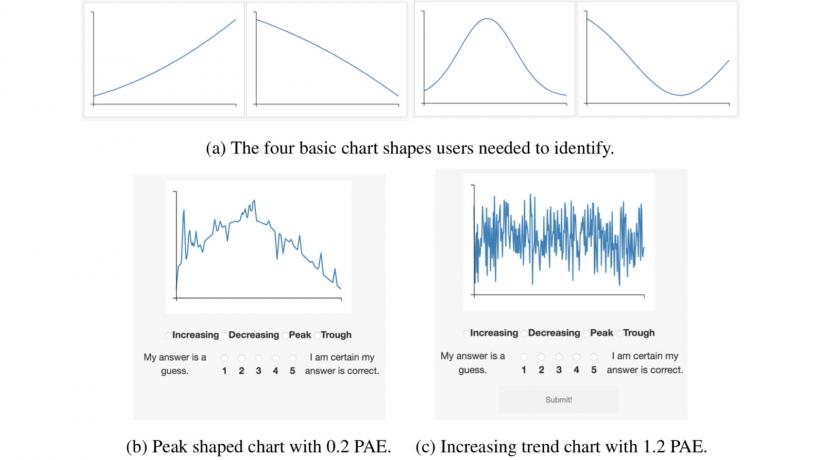
Figure showing an example of one of the user studies, in which users had to classify charts based on their shape. The chart on the right shows an example of a complex chart which would receive a high complexity score (c). Intuitively, it is more difficult to read than the chart on the left. To improve readability, a visualization program could enhance important aspects of the data to make it easier to read.
“This is a brand new approach to working with line charts with many different potential applications,” says Ryan, first author on the paper. “Our method gives visualization systems a way to measure how difficult line charts are to read, so now we can design these systems to automatically simplify or summarize charts that would be hard to read on their own.”
Other than visually inspecting a visualization, there have been few ways to automatically quantify the complexity of a data visualization. To solve this problem, Wu’s group created Pixel Approximate Entropy to provide a “visual complexity score” that can automatically identify difficult charts. They modified a low dimensional entropy measure to operate on line charts, and then conducted a series of user studies that demonstrated the measure could predict how well users perceived charts.
“In fast-paced settings, it is important to know if the visualization is going to be so complex that the signals may be obscured,” says Wu, who is also co-chair of the Data, Media, & Society Center in the Data Science Institute. “The ability to quantify complexity is the first step towards automatically doing something about this.”
The team expects their system, which is open source, will be especially useful to data scientists and engineers who are developing AI-driven data science systems. By providing a method that allows the system to better understand the visualizations it is displaying, Pixel Approximate Entropy will help to drive the development of more intelligent data science systems.
“For instance, in industrial control an operator may need to observe and react to trends in readouts from a variety of system monitors over time, such as at a chemical or power plant,” Ryan adds. “A system that is aware of chart complexity could adapt readouts to ensure the operator can identify important trends and reduce fatigue from trying to interpret potentially noisy signals.